Teamplast is a company in constant evolution: every year we try to improve something substantial in our processes. We are faithful to the motto "he who stops is lost", convinced that renewal is also synonymous with progress.
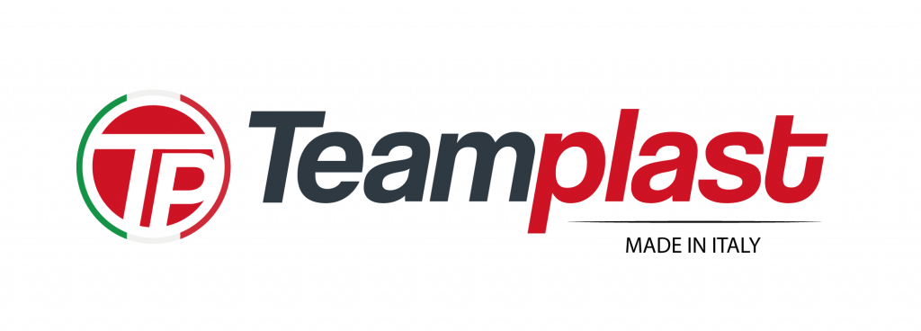
The new Teamplast logo
This year we decided to give ourselves a new face, through a restyling of our logo and our website.
The new Teamplast logo maintains the institutional colours unchanged, which underline the strength and excellence of the Made in Italy while we chose the Coolvetica font to give continuity to the previous one, which remains similar, but gives it greater rigor.
The restyling of the Teamplast website
The website is designed on the basis of greater usability than the previous one: a site that is easy to navigate and that highlights not only our distinctive factors but above all our products and the ability to create many others, tailored to the customer.
The navigation structure is simple and immediate: the contents underline our experience in the flexible plastic packaging sector and at the same time our ability to adapt to market evolutions and respond to the increasingly complex requests of the sector.
For the occasion we have created photos of our main products and the company video that you can see on our “Company” page or by clicking here.


